No-Code Demand Forecasting Dashboards for Confident Inventory Planning

Today we explore no-code demand forecasting dashboards for inventory planning, showing how operations and supply teams can anticipate demand, balance stock, and act decisively without writing code. We will connect practical data pipelines, intuitive forecasting methods, and replenishment logic to create living, collaborative tools. Expect real stories, measurable outcomes, and step-by-step clarity, from spreadsheet foundations to automated alerts and approvals. Bring your toughest SKU challenges, and get ready to build something useful this week, share it with teammates, gather feedback, and iterate without waiting for engineering backlogs.

Start With Clarity: What Your Dashboard Must Prove

Before crafting visuals, articulate the decisions the dashboard should accelerate: how much to buy, when to reorder, and where to position stock across channels. Translate these decisions into testable questions, trace them to data sources, and anchor success in measurable outcomes like fewer stockouts, lower holding costs, and faster cycle times. Invite stakeholders early, document assumptions plainly, and prototype quickly using sample SKUs so every chart, control, and alert directly serves a decision rather than merely decorating a screen.

Map Decisions to Visuals

List the weekly or daily calls planners must make, then attach each to a chart, table, or control that clarifies action in seconds. If the call is reorder approval, show forecast, uncertainty, and service risk together. Keep explanations visible, use concise annotations, and avoid vanity metrics. Involve finance, sales, and operations so visuals reflect shared reality, not siloed opinions, and pressure-test with a difficult SKU carrying erratic demand and long lead times.

Define Granularity Without Chaos

Choose the lowest planning level that still enables action—SKU by location, channel, or fulfillment node—then include quick aggregations to roll up patterns. Too fine, and noise overwhelms; too coarse, and signals blur. Provide filters and bookmarks to jump between executive summaries and tactical worklists. Set clear naming for variants and packs so quantities, units, and conversions never confuse. Document any constraints on history length or partial data so trust builds through transparency.

Choose Metrics That Drive Action

Prioritize metrics that change behavior: forecast bias, MAPE, weighted MAPE by revenue, service level, days of supply, and stockout minutes. Display them next to cost impacts, not buried on a separate page. Align definitions with finance and customer success so everyone recognizes real wins. Surface trade-offs explicitly, like service versus carrying cost, using sliders or toggles. Encourage comments near metrics, ask for weekly reflections, and archive snapshots to show learning over time.

Data, Connected Seamlessly

Reliable forecasts start with clean, contextual data stitched from sales orders, POS feeds, ecommerce platforms, inventory snapshots, supplier lead times, and calendars of marketing events. With no-code connectors, you can centralize sources into governed tables, then standardize timestamps, units, and identifiers. Track refresh cadence, ownership, and quality checks in the dashboard itself. Keep a living data contract describing joins and assumptions so contributors understand how numbers flow. Simplicity wins: fewer pipelines, clearer lineage, faster iteration.

Forecasts Built With Clicks, Not Code

You can deliver credible predictions using approachable methods and transparent controls. Start with naive and moving-average baselines, then layer single and double exponential smoothing for trend. Provide sliders for smoothing factors and horizon, with instant recomputation and side-by-side error comparisons. Explain uncertainty using prediction intervals rather than mysterious scores. Keep methods human-explainable so planners can defend numbers in meetings. Version results by week, label assumptions, and permit quick overrides with auditable notes when reality changes suddenly.

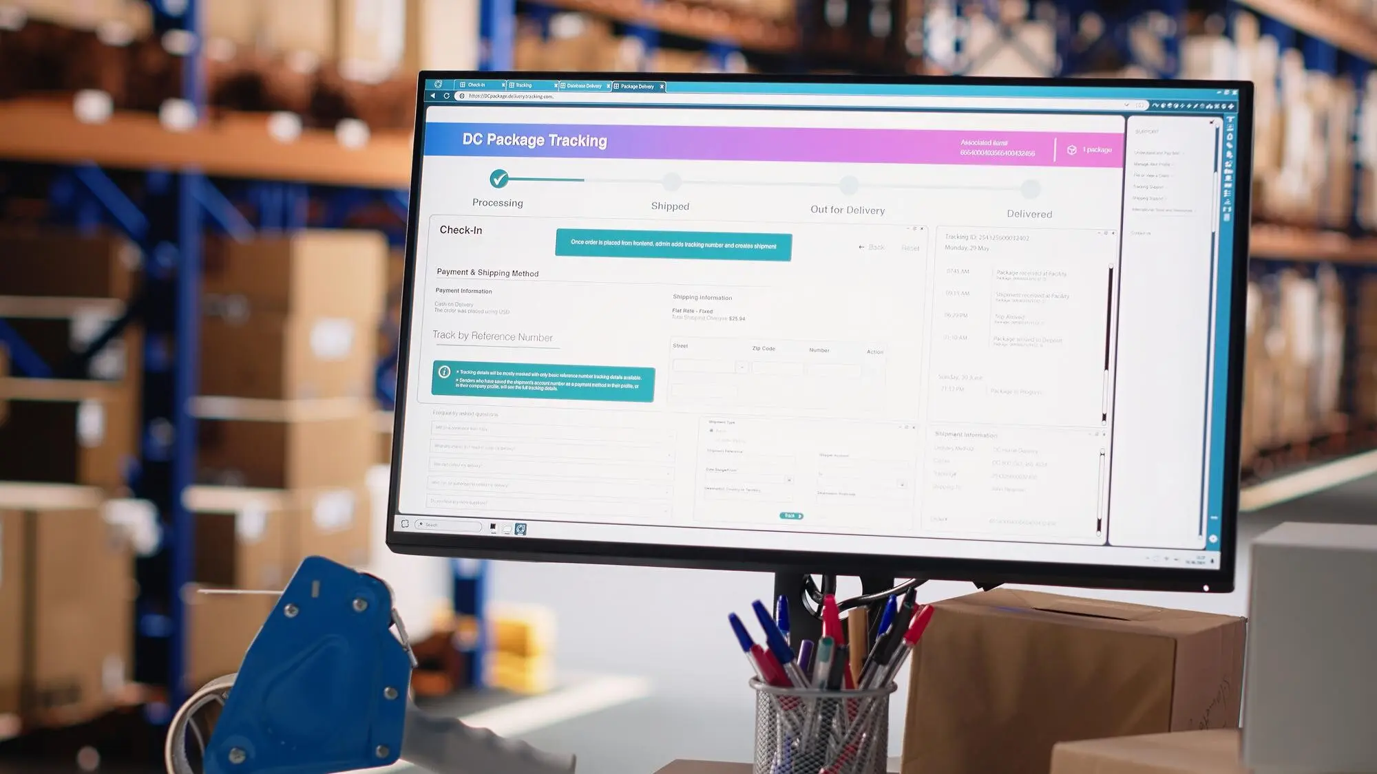
From Predictions to Replenishment

Service Levels That Reflect Reality

Replace wishful thinking with explicit targets per category and customer promise. Tie service levels to penalties, reputation risk, and margin. Display historical performance and variability so targets feel justified. Compute safety stock using forecast error and lead-time variation, showing how each component contributes. Provide a quick scenario tuner to see what a two-point service increase costs in carrying dollars. Encourage monthly reviews so targets evolve with assortment shifts and promotional intensity.

Lead Times, Variability, and Reorder Points

Store supplier lead times as distributions, not single numbers, capturing recent volatility and exceptions. Combine these with forecast error to calculate reorder points that actually protect service. Visualize the protective buffer and next expected breach date. Flag risky suppliers whose variance erodes confidence, prompting earlier orders or dual sourcing. Let planners adjust assumptions temporarily during holidays, strikes, or port delays, while the dashboard records context and reverts once normal conditions return.

Constraints, Batches, and Budget Awareness

Great recommendations honor reality. Incorporate case packs, MOQs, truckload minimums, and shelf-life limits before suggesting quantities. Show the minimal feasible order and the next efficient frontier within budget, highlighting waste avoided by batching smartly. Provide a compact capacity summary so warehouses and finance see impacts immediately. Let planners pin recommendations, group them for consolidated buys, and export supplier-ready summaries with one click, capturing who approved what and when for clear accountability.

Automations That Keep Planners In The Loop

No-code orchestrations free humans to solve exceptions. Schedule data refreshes, calculate forecasts, post worklists, and trigger alerts through tools like Zapier, Make, or Power Automate. Send Slack or email summaries when risk crosses thresholds, and open lightweight approval tasks for changes. Maintain an audit trail, snapshot forecasts weekly, and archive comments with outcomes. Keep everything reversible, simple, and documented so new team members can onboard quickly and trust that the machine supports—not replaces—their judgment.

Adoption, Storytelling, and Trust

Tools succeed when people believe them. Frame the dashboard as a partner that reduces weekend firefighting and explains outcomes in human terms. Tell success stories, like a planner who cut emergency airfreight after taming one chaotic SKU. Teach concepts through narratives, not math symbols. Run short training loops, gather feedback visibly, and improve in days, not quarters. Ask readers to share their hardest planning bottleneck, subscribe for new playbooks, and request live teardown sessions of their current spreadsheets.